Neighborhood Transit Accessibility Across America
Explore how access to public transportation varies across neighborhoods in dozens of U.S. cities. Proximity to Transit Stops is one of the four variables used in the EPA National Walkability Index because neighborhoods with convenient access to transit provide greater transportation choice, improved accessibility, and stronger support for walking.
Quick Statistics
2,740
Neighborhoods Analyzed
14.87
Average Transit Accessibility Score
1-20
Observed Transit Range
Explore the interactive map below to examine neighborhood proximity to transit stops across the United States. While this map focuses on proximity, it should be interpreted alongside the EPA’s broader concepts of Transit Accessibility (D4) and Destination Accessibility (D5) to better understand how transportation systems connect residents to jobs, services, and daily opportunities (U.S. Environmental Protection Agency, 2021b).
Other Variables of the National Walkability Index- Neighborhood Level
Neighborhood Walkability
Explore neighborhood-level walkability to identify local variations in accessibility, connectivity, and the built environment within municipalities.
Neighborhood Intersection Density
Compare street connectivity across neighborhoods to identify highly connected areas that support safer and more direct pedestrian travel.
Neighborhood Employment Mix
Analyze how employment opportunities are distributed within neighborhoods and how local land uses support walkability.
Neighborhood Jobs & Housing Mix
Measure the balance between employment and residential development within neighborhoods to better understand mixed-use environments.
Further Reading
Key Takeaways
- Transit accessibility varies considerably within municipalities. Neighborhood-level analysis reveals substantial differences in access to public transportation that are often masked by municipal averages, highlighting the importance of evaluating neighborhoods individually.
- The highest transit accessibility is concentrated in compact urban centers. Downtowns, university districts, historic neighborhoods, and transit-oriented developments consistently provide the greatest access to bus routes, rail stations, and multimodal transportation networks.
- Lower transit accessibility is commonly associated with dispersed or specialized land uses. Rural communities, suburban neighborhoods, airports, industrial districts, military installations, and large parks often receive lower scores because these areas support lower transit demand or have limited public access.
- Convenient access to transit encourages walking and expands transportation choice. Planning research consistently shows that neighborhoods with accessible transit service generate higher levels of walking, reduce automobile dependence, and improve regional accessibility (Cervero & Gorham, 1995; Frank et al., 2005; Ewing & Cervero, 2010).
- Proximity to transit is one component of neighborhood walkability rather than a complete measure. While convenient transit access strengthens accessibility, planners should also evaluate street connectivity, land-use diversity, pedestrian infrastructure, safety, and community context to fully understand how well a neighborhood supports walking and multimodal travel.
Neighborhoods-Distribution of EPA Proximity to Transit Scores
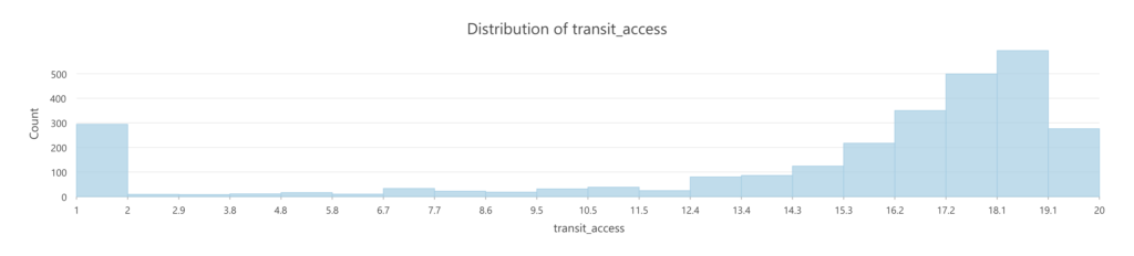
Distribution of EPA Proximity to Transit Scores for U.S. Neighborhoods:
- Sample size (2,740 Neighborhoods)
- Mean = 14.87
- Median = 17.14
- Min = 1
- Max = 20
- SD = 5.65
Neighborhood Proximity to Transit Analysis
Classification Categories
The American Walkability Atlas classifies neighborhoods into five categories based on their Proximity to Transit Stops scores. This variable measures how easily residents can access public transportation by walking and serves as one of the four components of the EPA’s National Walkability Index. Neighborhoods located closer to transit stops generally provide residents with greater mobility options, improved regional accessibility, and reduced dependence on private automobiles. Numerous studies have shown that neighborhoods with convenient access to public transit are more likely to support walking, encourage multimodal travel, and reduce automobile use (Cervero & Gorham, 1995; Cervero & Kockelman, 1997; Ewing & Cervero, 2010).
- Very Low Transit Access: Areas where the nearest transit stop is relatively far from the population center of the block group. These locations have the lowest relative proximity to public transit and therefore provide limited transit access as measured by the EPA National Walkability Index.
- Low Transit Access: Areas with relatively long walking distances to the nearest transit stop. Transit may be present, but its distance from the population center provides comparatively limited access and less support for walking-related travel.
- Below Average Transit Access: Areas where transit stops are somewhat closer to the population center but remain farther away than in more transit-accessible locations. These areas provide some access to transit but remain below the middle range of relative transit proximity.
- Moderate Transit Access: Areas with an intermediate walking distance between the population center and the nearest transit stop. These locations represent the middle range of transit proximity and provide a moderate level of transit access relative to other areas.
- Above Average Transit Access: Areas where the nearest transit stop is relatively close to the population center. Shorter walking distances provide stronger access to public transit and create built-environment conditions more supportive of walking.
- High Transit Access: Areas with short walking distances to the nearest transit stop. Their relatively strong transit proximity provides convenient access to public transportation and is associated with conditions that are more supportive of walking.
- Very High Transit Access: Areas with the shortest relative walking distances between the population center and the nearest transit stop. These locations represent the highest level of transit proximity and the strongest relative transit access measured by this component of the National Walkability Index.
Planning Implications
Access to public transportation is a critical component of neighborhood accessibility because it expands residents’ ability to reach employment, education, healthcare, shopping, recreation, and other daily destinations beyond walking distance. The EPA includes proximity to transit as one of the four variables within the National Walkability Index because neighborhoods with convenient transit access generally provide greater transportation choice and reduce reliance on private automobiles.
Research consistently demonstrates that neighborhoods combining high transit accessibility with connected street networks and mixed land uses generate higher levels of walking than neighborhoods lacking these characteristics. Cervero and Gorham (1995) found that residents living in transit-oriented neighborhoods were more likely to use public transportation and walk than those living in automobile-oriented environments. Likewise, Frank et al. (2005) and Ewing and Cervero (2010) concluded that transit accessibility is closely associated with increased walking and reduced vehicle travel.
Neighborhoods with High and Very High Transit Accessibility often benefit from planning strategies that preserve and strengthen existing transit service while improving pedestrian connections through sidewalk upgrades, ADA-compliant crossings, bicycle facilities, and transit-supportive land uses. Transit-oriented development, mixed-use infill, and complete streets policies can further strengthen these neighborhoods by creating environments where walking and transit reinforce one another.
Neighborhoods with Low or Very Low Transit Accessibility may benefit from long-term investments that expand transit service, improve first- and last-mile connections, construct sidewalks and shared-use paths, and encourage compact mixed-use development around future transit corridors. However, planners should recognize that some low-scoring neighborhoods consist primarily of parks, airports, industrial districts, rural landscapes, or other specialized land uses where limited transit access reflects the intended function of the area rather than a planning deficiency.
Ultimately, transit accessibility should be evaluated alongside street connectivity, land-use diversity, pedestrian infrastructure, and community needs to support equitable and efficient transportation planning.
Understanding Neighborhood Walkability
Transit accessibility plays an important role in neighborhood walkability because public transportation begins and ends with walking. Every transit trip requires pedestrians to travel between their origin or destination and a transit stop, making safe and convenient pedestrian access essential for effective transit use.
At the neighborhood level, proximity to transit measures how easily residents can reach bus stops, rail stations, or other public transportation facilities on foot. Unlike municipal averages, neighborhood-level analysis captures localized differences that often exist within the same city. A downtown neighborhood may provide access to dozens of transit routes within a short walk, while neighborhoods only a few miles away may have limited or no transit service.
High transit accessibility generally supports:
- Greater transportation choice.
- Reduced automobile dependence.
- Improved access to employment and essential services.
- Increased opportunities for walking as part of daily travel.
- More equitable mobility for residents who cannot or choose not to drive.
However, transit proximity alone does not determine overall walkability. A neighborhood may be located near transit stops but still experience poor pedestrian conditions due to missing sidewalks, unsafe street crossings, heavy traffic, or limited nearby destinations. Likewise, some neighborhoods with moderate transit access may still provide high-quality walking environments because of compact street networks and mixed land uses. Therefore, transit accessibility should be considered alongside the other components of the National Walkability Index to provide a more complete understanding of neighborhood accessibility.
Geographic Patterns in Neighborhood Walkability
The neighborhood-level Proximity to Transit results reveal one of the clearest geographic divisions in the walkability analysis: neighborhoods located within cities with extensive transit networks generally receive high scores, while neighborhoods in cities with limited qualifying transit service can receive extremely low scores regardless of their street connectivity, density, or central-city location. Across the 2,740 neighborhoods in the dataset, the average transit-access score is approximately 14.86, with a median of 17.14. Scores range from 1.00 to 20.00, demonstrating substantial variation in access to transit among the neighborhoods studied.
Using the same seven fixed intervals with an interval size of approximately 2.857143, the distribution is heavily concentrated toward the upper end of the scale. 302 neighborhoods (11.0%) fall between 0–2.86, 36 (1.3%) between 2.86–5.71, 65 (2.4%) between 5.71–8.57, 87 (3.2%) between 8.57–11.43, 190 (6.9%) between 11.43–14.29, 691 (25.2%) between 14.29–17.14, and 1,366 (49.9%) between 17.14–20.00. Thus, approximately three-quarters of all neighborhoods fall within the two highest classes, although a substantial group remains concentrated at the very bottom of the scale.
This produces a more polarized distribution than might initially be expected. Rather than neighborhoods being evenly distributed across the seven classes, many are clustered either toward very high transit accessibility or very low transit accessibility. This is particularly important when interpreting the National Walkability Index because proximity to transit reflects the availability of a transportation alternative to the automobile rather than simply the physical form of the neighborhood.
The geographic pattern is especially apparent in major metropolitan areas. Los Angeles contains numerous neighborhoods with high transit-access scores, including Downtown (19.43), Chinatown (19.33), Koreatown (19.12), Watts (19.28), West Adams (19.22), Exposition Park (19.76), and Rancho Park (19.50). At the same time, peripheral or geographically constrained neighborhoods can score considerably lower, including Bel-Air (3.80), Beverly Crest (1.00), Chatsworth Reservoir (1.00), Porter Ranch (5.53), and Shadow Hills (5.67).
A similar internal pattern appears in Houston. Downtown scores 18.80, the Medical Center Area 19.00, Greater Third Ward 18.93, Midtown 18.00, and Harrisburg/Manchester/Smith Addition reaches the maximum score of 20.00. By comparison, Greater Hobby Area scores 5.00, Willowbrook 4.00, the IAH/Airport Area 6.13, Kingwood Area 1.41, Lake Houston 1.00, Clear Lake 1.69, Edgebrook Area 2.00, and Addicks Park Ten 4.57. This suggests a pronounced spatial difference between transit-rich central or inner-city districts and many peripheral areas.
Dallas exhibits the same general tendency. The Central Business District scores 19.33, Oak Lawn 18.00, Oak Cliff approximately 18.03, Victory Park 18.00, Uptown 17.88, Old East Dallas 18.29, and Knox/Henderson approximately 19.67. In contrast, Far Northwest Dallas scores 10.50, Southwest Dallas 9.75, Preston Hollow 10.14, and the Kleberg-Rylie Area only 5.21. The contrast illustrates how transit accessibility can decline considerably as development extends away from major transit corridors and central activity centers.
Downtowns and central-city neighborhoods
Downtown neighborhoods generally perform strongly in this measure. Among the 52 neighborhoods containing “Downtown” in their names, the mean transit-access score is approximately 15.67, while the median is approximately 18.71. Examples include Long Beach Downtown (19.90), Los Angeles Downtown (19.43), San Diego Downtown (18.93), Urban Honolulu Downtown (19.40), Miami Downtown (19.06), Irving Downtown (18.67), Bellevue Downtown (18.80), and Portland Downtown (19.78). Long Beach’s Downtown score of 19.90 contrasts sharply with several of the city’s neighborhoods that receive scores of 1.00.
Portland provides another strong example of widespread transit accessibility. Portland Downtown scores approximately 19.78, Old Town–Pearl District 19.67, Kerns 19.40, Cathedral Park 19.00, Buckman 19.00, Northwest District 19.18, and South Portland 19.40. High scores are not limited to the downtown core; numerous residential neighborhoods also fall well into the upper classes.
This is an important distinction from intersection density. A neighborhood does not necessarily need to possess a traditional downtown street grid to achieve high transit accessibility. Transit service can extend high accessibility into residential neighborhoods, employment centers, institutional districts, and corridors located outside the central business district. Consequently, the spatial pattern of transit accessibility tends to follow transit networks and corridors rather than street-network form alone.
The significance of very low scores
One of the most striking characteristics of the transit results is the large number of neighborhoods receiving a score of 1.00. The lowest class contains 302 neighborhoods, or approximately 11 percent of the entire dataset. In some cases, these low values correspond to peripheral, low-density, environmentally constrained, or specialized areas. Examples include Irvine’s Turtle Ridge, Northwood Point, Orchard Hills, and Limestone Canyon–Portola Springs–Gateway Village. Portland’s Forest Park–Linnton area also receives a score of 1.00, whereas most of Portland’s more developed neighborhoods receive much higher values.
However, the data also reveal an especially important limitation when interpreting these scores geographically: some entire cities are concentrated at the minimum value. All 23 San Angelo neighborhoods in the dataset score 1.00, including Downtown, Central, Santa Rita, Angelo Heights, ASU–College Hills, and Goodfellow Air Force Base. Similarly, all 25 Waco neighborhoods receive a score of 1.00, including Downtown and Baylor.
The same phenomenon occurs in Baton Rouge and Shreveport. Baton Rouge’s Downtown, LSU, Mid City, North Baton Rouge, Southern University, and numerous other neighborhoods all receive the minimum value of 1.00. Arlington is also heavily concentrated near the minimum, with its six areas ranging only from 1.00 to approximately 1.63.
This creates an important interpretive difference between neighborhood-level and city-level transit patterns. In Los Angeles, Portland, Houston, or Dallas, proximity to transit can vary substantially from one neighborhood to another because transit service itself varies geographically within the city. In San Angelo, Waco, Baton Rouge, or Shreveport, however, the measure provides little or no differentiation among neighborhoods because nearly every neighborhood receives the same minimum score. In these cases, the transit variable functions less as a measure of differences within the city and more as an indication of differences between metropolitan transit systems.
Relationship with overall walkability
Proximity to transit should therefore be interpreted as a distinct dimension of walkability. A neighborhood may have a highly connected street grid, relatively short blocks, and other characteristics supportive of pedestrian movement while still receiving a very low transit-access score. San Angelo provides a particularly useful example. In the preceding intersection-density analysis, Downtown and Central both scored 18.00, indicating highly connected street networks. Yet both receive only 1.00 for proximity to transit in the present dataset.
That contrast illustrates why the individual components of the National Walkability Index should not be treated interchangeably. Intersection density measures the connectivity of the street network, whereas proximity to transit captures access to transit service. A neighborhood can perform strongly on one and poorly on the other.
Conversely, neighborhoods in transit-rich metropolitan areas can benefit from the interaction of several favorable characteristics. Central neighborhoods in places such as Portland, Los Angeles, Miami, Houston, and Long Beach frequently combine high transit-access scores with connected street networks and mixed land uses. This helps explain why central and inner-city neighborhoods often emerge among the strongest overall walkability environments.
Overall Pattern
Overall, Proximity to Transit produces one of the strongest geographic contrasts in the neighborhood dataset. Nearly half of all neighborhoods (49.9%) fall within the highest 17.14–20.00 class, and another 25.2% fall between 14.29 and 17.14. At the opposite end, however, 11.0% fall within the lowest 0–2.86 class. The middle classes contain comparatively few neighborhoods.
The result is a distinctly polarized spatial pattern. Large, transit-rich metropolitan areas contain extensive clusters of neighborhoods in the upper classes, while some smaller or more automobile-oriented cities contain entire groups of neighborhoods at or near the minimum score. Even within transit-rich cities, peripheral neighborhoods, low-density areas, parks, reservoirs, airports, and other geographically isolated locations frequently fall below their central-city counterparts.
This makes proximity to transit especially useful for distinguishing between pedestrian-friendly urban form and multimodal accessibility. A connected street network can make walking physically practical within a neighborhood, but transit extends the range of destinations that can be reached without an automobile. Consequently, high transit accessibility can strengthen the usefulness of walking by allowing pedestrian trips to connect with a broader regional transportation network.
The geographic results therefore suggest that proximity to transit operates at two interconnected scales. At the metropolitan scale, the existence and extent of the regional transit system determine whether neighborhoods have meaningful opportunities for high scores. At the neighborhood scale, proximity to routes, stations, and transit corridors determines how those opportunities are distributed within the city. The contrast between transit-rich cities such as Portland and Los Angeles and uniformly low-scoring cities such as San Angelo and Waco demonstrates the importance of both scales.
Taken together with the intersection-density results, the analysis also shows why a neighborhood should not be described as walkable or unwalkable on the basis of a single variable. Street connectivity describes how easily pedestrians can move through the local network; proximity to transit describes how effectively that local pedestrian network connects to destinations beyond the neighborhood. Examining the two together therefore provides a more complete understanding of accessibility and helps explain why neighborhoods with otherwise similar physical forms can exhibit substantially different overall walkability outcomes.
Why Transit Matters
Access to reliable public transportation is an essential component of healthy, sustainable, and economically resilient communities. The U.S. Environmental Protection Agency (EPA) recognizes that neighborhoods with strong transit accessibility and walkable street networks can improve quality of life by expanding transportation options, reducing automobile dependence, and increasing access to jobs and essential services (U.S. Environmental Protection Agency, 2021b, 2021a).
Health Benefits
Walkable, transit-accessible neighborhoods encourage residents to incorporate physical activity into their daily routines by walking to transit stops, workplaces, shops, schools, and community destinations. According to the EPA, communities designed to support walking are associated with increased physical activity, lower rates of obesity, improved cardiovascular health, and greater opportunities for social interaction. Walkable environments can also improve pedestrian safety when supported by well-connected street networks and appropriate infrastructure (U.S. Environmental Protection Agency, 2021a).
Environmental Benefits
Providing convenient access to public transportation can reduce reliance on private automobiles, helping decrease vehicle miles traveled, fuel consumption, greenhouse gas emissions, and air pollution. The EPA identifies transit accessibility as an important component of creating more sustainable development patterns that support efficient land use and reduce the environmental impacts associated with automobile-dependent communities (U.S. Environmental Protection Agency, 2021b, 2021a).
Economic Benefits
Neighborhoods with good transit access connect residents to employment centers, educational institutions, healthcare facilities, retail destinations, and other essential services. By improving mobility and expanding access to opportunities, transit accessibility can reduce transportation costs for households, support local businesses, and strengthen regional economic competitiveness. The EPA’s Smart Location Database incorporates measures of both Transit Accessibility (D4) and Destination Accessibility (D5) because successful communities depend not only on the availability of transit service but also on how effectively residents can reach everyday destinations (U.S. Environmental Protection Agency, 2021a).
Supporting Better Community Planning
For planners, policymakers, and community leaders, evaluating transit accessibility provides valuable insight into how well neighborhoods support mobility, equity, and sustainable growth. When considered alongside walkability, land use patterns, and destination accessibility, transit data helps identify areas where transportation investments, zoning decisions, and infrastructure improvements can expand opportunities and improve residents’ quality of life (U.S. Environmental Protection Agency, 2021b).
EPA Methodology: How Transit Accessibility Is Measured
The Environmental Protection Agency (EPA) evaluates transit accessibility as part of its Smart Location Database (SLD), a nationwide dataset designed to measure how well neighborhoods connect residents to transportation, jobs, and everyday destinations. Rather than measuring only the distance to the nearest transit stop, the EPA recognizes that high-quality transit access depends on both the availability and quality of transit service (U.S. Environmental Protection Agency, 2021b).
EPA’s Transit Accessibility Indicators
The EPA measures transit accessibility using six primary indicators:
- Distance to the nearest transit stop – Measures how far residents must travel to reach the closest public transit stop.
- Employment within ¼ mile of fixed-guideway transit – Estimates the number of jobs located within a comfortable walking distance (approximately five minutes) of rail stations or other fixed-guideway transit services.
- Employment within ½ mile of fixed-guideway transit – Expands the analysis to include a broader walking distance (approximately ten minutes), capturing additional employment opportunities served by high-capacity transit.
- Transit service frequency – Evaluates how often transit vehicles arrive throughout the day. Frequent service generally provides shorter wait times and makes transit a more practical transportation option.
- Transit frequency per square mile – Measures the concentration of transit service available within a geographic area.
- Transit frequency per capita – Adjusts transit service by population, helping planners compare whether neighborhoods receive transit service proportional to the number of residents they serve (U.S. Environmental Protection Agency, 2021b).
Why These Measures Matter
These indicators recognize that simply living near a transit stop does not guarantee meaningful access. A neighborhood may have a nearby bus stop, but if buses arrive only once an hour or provide limited connections, residents still face significant transportation barriers. Conversely, neighborhoods served by frequent transit and connected to major employment centers offer residents greater mobility, reduced automobile dependence, and improved access to jobs, education, healthcare, and essential services. This broader approach allows planners to evaluate not just whether transit exists, but how effectively it serves the community (U.S. Environmental Protection Agency, 2021b).
How the EPA Calculates Transit Accessibility
To produce these measures nationwide, the EPA combines several data sources:
- General Transit Feed Specification (GTFS) data from transit agencies
- U.S. Census population and employment data
- Census block group geography
- Population-weighted centroids representing where residents actually live within each block group
- National transportation network data
These datasets are integrated within the EPA’s Smart Location Database to create consistent transit accessibility metrics for neighborhoods across the United States (U.S. Environmental Protection Agency, 2021b).
Transit Accessibility and Walkability
Transit accessibility is one component of the EPA’s broader framework for evaluating neighborhood quality. The EPA organizes the Smart Location Database into five complementary categories:
- Density
- Diversity of land uses
- Design of the street network
- Transit Accessibility
- Destination Accessibility
Together, these measures provide a more complete understanding of how easily residents can walk, bike, use transit, and reach daily destinations. This integrated approach also supports the EPA’s National Walkability Index, which was developed to help planners, researchers, and communities identify places where walking is practical, safe, and connected to essential services (U.S. Environmental Protection Agency, 2021b, 2021a).
Understanding Proximity, Transit Accessibility, and Destination Accessibility
Although these concepts are closely related, the U.S. Environmental Protection Agency (EPA) distinguishes them as separate measures within its Smart Location Database (SLD). Understanding these differences helps readers interpret the interactive map more accurately.
Neighborhood Proximity to Transit Stops
Neighborhood proximity measures how close residents are to the nearest public transit stop. This is the simplest measure of transit access and serves as the focus of the interactive map on this page.
Shorter walking distances generally make public transportation more convenient and encourage greater transit use. However, proximity alone does not indicate how useful or effective the transit service actually is.
For example, two neighborhoods may both be located within a five-minute walk of a bus stop, yet one may offer buses every 10 minutes while the other offers service only once each hour.
Transit Accessibility (EPA D4)
The EPA refers to the broader concept of Transit Accessibility as D4 within the Smart Location Database. Rather than focusing solely on distance, D4 evaluates the overall quality of transit service available to residents.
According to the EPA, Transit Accessibility includes measures such as:
- Distance to the nearest transit stop
- Employment within ¼ mile of fixed-guideway transit
- Employment within ½ mile of fixed-guideway transit
- Transit service frequency
- Transit frequency per square mile
- Transit frequency per capita
Together, these indicators measure not only whether transit is nearby, but also how frequently it operates and how effectively it connects people to employment opportunities throughout the region (U.S. Environmental Protection Agency, 2021b).
Destination Accessibility (EPA D5)
The EPA identifies Destination Accessibility as D5, a separate component of the Smart Location Database.
Rather than measuring access to transit, Destination Accessibility measures how easily residents can reach important destinations, regardless of the transportation mode used.
Examples include access to:
- Employment centers
- Retail and commercial districts
- Schools and universities
- Healthcare facilities
- Parks and recreational amenities
- Other daily destinations
Neighborhoods with high destination accessibility allow residents to reach many essential services within relatively short travel times, supporting walking, bicycling, public transit, and reduced automobile dependence (U.S. Environmental Protection Agency, 2021b).
How These Measures Work Together
The three concepts build upon one another:
Measure | Primary Question | EPA Framework |
Neighborhood Proximity | How close is the nearest transit stop? | Component of D4 |
Transit Accessibility (D4) | How useful and extensive is the transit system? | Transit Accessibility |
Destination Accessibility (D5) | How easily can residents reach jobs and everyday destinations? | Destination Accessibility |
For example, a neighborhood may have a transit stop only a short walk away (high proximity), but if buses arrive infrequently or provide limited regional connections, its overall transit accessibility may still be relatively low. Likewise, even neighborhoods with excellent transit service may have lower destination accessibility if employment centers, shopping districts, healthcare facilities, and other key destinations remain difficult to reach.
How This Relates to the Interactive Map
The interactive map on this page focuses specifically on neighborhood proximity to transit stops. While proximity is an important first indicator of transit access, the EPA recommends evaluating it alongside Transit Accessibility (D4) and Destination Accessibility (D5) to develop a more comprehensive understanding of neighborhood connectivity and mobility. Together, these measures help planners assess how effectively communities support walking, public transportation, and access to daily opportunities (U.S. Environmental Protection Agency, 2021b).
Limitations of Measuring Proximity to Transit Stops
Neighborhood proximity to transit stops is an important indicator of accessibility, but it represents only one aspect of a community’s transportation network. While proximity measures how close residents are to public transit, it does not evaluate the quality, reliability, or usefulness of the transit service itself.
The U.S. Environmental Protection Agency (EPA) recognizes this distinction by including proximity as one component of its broader Transit Accessibility (D4) framework, alongside measures of transit service frequency, employment accessibility, and regional connectivity (U.S. Environmental Protection Agency, 2021b).
What This Map Measures
This interactive map measures:
- The relative proximity of neighborhoods to public transit stops.
- Potential walkable access to transit based on location.
- Geographic differences in neighborhood access to transit infrastructure.
These measures help identify areas where residents may have convenient access to public transportation and provide a useful starting point for evaluating neighborhood mobility.
What This Map Does Not Measure
Proximity alone does not capture several important aspects of transit accessibility, including:
- Transit service frequency – How often buses, trains, or other transit vehicles arrive.
- Service reliability – Whether transit operates consistently and on schedule.
- Hours of operation – Availability during evenings, weekends, and holidays.
- Route connectivity – How easily riders can transfer between routes or reach regional destinations.
- Destination accessibility – Whether transit provides efficient access to employment centers, schools, healthcare facilities, shopping, parks, and other everyday destinations.
- Pedestrian infrastructure – The presence and quality of sidewalks, crosswalks, lighting, curb ramps, and other features that influence the safety and comfort of walking to transit.
- Accessibility for people with disabilities – Whether transit stops and pedestrian routes comply with accessibility standards and accommodate users of all abilities.
- Topography and physical barriers – Hills, highways, rail corridors, rivers, and other obstacles that may increase the difficulty of reaching a nearby transit stop.
Interpreting the Results
Neighborhoods with high proximity scores generally provide residents with shorter walking distances to transit stops. However, nearby transit does not necessarily mean that service is frequent, convenient, or well connected to regional destinations.
Conversely, some neighborhoods may have fewer nearby transit stops but still provide excellent mobility through high-frequency service, rapid transit corridors, or direct connections to major employment centers.
For these reasons, the EPA recommends evaluating Neighborhood Proximity, Transit Accessibility (D4), and Destination Accessibility (D5) together to develop a more comprehensive understanding of neighborhood mobility and transportation access (U.S. Environmental Protection Agency, 2021b).
A Comprehensive Planning Perspective
Professional planners rarely rely on a single metric when evaluating transportation systems. Instead, proximity to transit is considered alongside land use patterns, street connectivity, transit service quality, and access to destinations. Together, these measures provide a more complete picture of how effectively neighborhoods support walking, public transportation, and equitable access to opportunities. This integrated approach is reflected in the EPA’s Smart Location Database and National Walkability Index methodologies (U.S. Environmental Protection Agency, 2021b, 2021a).
References
- Cervero, R., & Gorham, R. (1995). Commuting in Transit Versus Automobile Neighborhoods. Journal of the American Planning Association, 61(2), 210–225. https://doi.org/10.1080/01944369508975634
- Cervero, R., & Kockelman, K. (1997). Travel demand and the 3Ds: Density, diversity, and design. Transportation Research Part D: Transport and Environment, 2(3), 199–219. https://doi.org/10.1016/S1361-9209(97)00009-6
- Ewing, R., & Cervero, R. (2010). Travel and the Built Environment: A Meta-Analysis. Journal of the American Planning Association, 76(3), 265–294. https://doi.org/10.1080/01944361003766766
- Frank, L. D., Schmid, T. L., Sallis, J. F., Chapman, J., & Saelens, B. E. (2005). Linking objectively measured physical activity with objectively measured urban form. American Journal of Preventive Medicine, 28(2), 117–125. https://doi.org/10.1016/j.amepre.2004.11.001
- S. Environmental Protection Agency. (2021a). National Walkability Index: Methodology and User Guide. U.S. Environmental Protection Agency (EPA). https://www.epa.gov/smartgrowth/smart-location-mapping#walkability
- S. Environmental Protection Agency. (2021b). Smart Location Database (SLD) 3.0: Technical Documentation and User Guide. U.S. Environmental Protection Agency. https://www.epa.gov/smartgrowth/smart-location-database-technical-documentation-and-user-guide