Municipality Proximity to Transit Stops
Explore how access to public transit varies across U.S. metropolitan statistical areas (MSAs). Proximity to transit is one of the four variables used in the EPA National Walkability Index because convenient access to buses, rail stations, and other transit services expands transportation choices and supports more walkable communities.
Quick Statistics
94
Metropolitan Areas Analyzed
6.64
Average Transit Accessibility
1.00–20
Observed Transit Score Range
The score isn’t a distance. Readers may assume:
“A score of 16 means I’m 16 minutes from transit.”
It doesn’t.
The EPA converts the underlying proximity values into a national ranking from 1 to 20. These values should be interpreted as relative accessibility rather than actual walking distance.
Other Variables of the National Walkability Index-Municipality Level
Municipal Walkability Index
Compare municipalities using the EPA National Walkability Index to evaluate overall walkability and identify regional patterns across communities.
Municipal Intersection Density
Analyze street network connectivity by measuring intersection density across municipalities to understand how street design influences walkability.
Municipal Employment Mix
Examine the diversity and concentration of employment opportunities across municipalities to better understand land use and economic activity.
Municipal Jobs & Housing Mix
Measure the relationship between employment and household distribution to evaluate land use balance and support planning decisions.
Further Reading
Key Takeaways
- Municipal proximity to transit varies substantially across the United States.
Municipal proximity-to-transit scores range from 1 to 20, demonstrating considerable differences in residents’ access to public transportation from one municipality to another. These differences reflect variations in transit service availability, urban development patterns, and population density. - Most municipalities exhibit limited access to public transit.
While a relatively small number of municipalities achieve very high proximity-to-transit scores, many communities receive lower scores, indicating that a significant share of residents have limited access to fixed-route transit services within convenient walking distance. - Transit accessibility is not distributed evenly across regions.
Municipalities in large metropolitan areas and older urban regions generally exhibit higher proximity-to-transit scores than many suburban, rural, and automobile-oriented communities, although substantial variation exists within every Census region, state, and metropolitan area. - Municipal proximity-to-transit scores provide a useful benchmark but should be interpreted with caution.
Each score represents an average across an entire municipality and may conceal important neighborhood-level differences. A municipality with a moderate overall score may still contain highly transit-accessible districts alongside neighborhoods with little or no nearby public transportation. - Proximity to transit can support transportation and land-use planning decisions.
Comparing municipal proximity-to-transit scores helps planners, researchers, and local governments identify underserved areas, prioritize transit investments, encourage transit-oriented development, improve multimodal accessibility, and support more connected and sustainable communities.
Distribution of EPA Proximity to Transit Scores

Distribution of EPA Proximity to Transit Scores for U.S. Cities:
- Sample size (6,255 cities)
- Mean = 6.64
- Median = 1.82
- Min = 1
- Max = 20
- SD = 6.5
Municipal Proximity to Transit Analysis
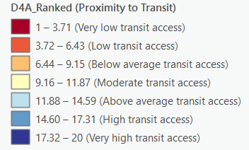
The proximity-to-transit indicator classifies municipalities into seven categories based on residents’ relative access to public transportation. The scores represent municipal averages of the U.S. Environmental Protection Agency’s ranked proximity-to-transit variable, D4A_Ranked, which ranges from 1 to 20. Higher scores generally indicate that a larger share of residents live within convenient walking distance of public transit, while lower scores indicate limited or no access to fixed-route transit services.
Unlike the complete National Walkability Index, proximity to transit measures only one dimension of accessibility. A municipality may provide frequent transit service while lacking connected street networks, mixed land uses, or pedestrian infrastructure. Likewise, many smaller municipalities receive low transit scores because fixed-route transit is unavailable, even if local neighborhoods remain highly walkable.
Classification Categories
- Very High Transit Accessibility (17.32–20.00): Municipalities where most residents have excellent access to public transportation through frequent bus, rail, subway, streetcar, or other transit services. Transit is a practical transportation option for many daily trips.
- High Transit Accessibility (14.60–17.31): Municipalities with strong transit availability and broad coverage. Most residents can reach transit stops within a reasonable walking distance, providing convenient alternatives to automobile travel.
- Above Average Transit Accessibility (11.88–14.59): Municipalities with moderate transit coverage serving many neighborhoods and activity centers. Transit is available for a substantial portion of residents, although service may be less frequent or geographically limited than in higher-scoring communities.
- Moderate Transit Accessibility (9.16–11.87): Municipalities where transit serves selected corridors, employment centers, or urban districts, but coverage remains inconsistent across the community. Many residents continue to rely primarily on private vehicles.
- Below Average Transit Accessibility (6.44–9.15): Municipalities with limited transit service or relatively few residents living within walking distance of transit stops. Public transportation plays only a minor role in everyday travel.
- Low Transit Accessibility (3.72–6.43): Municipalities with minimal transit coverage, infrequent service, or highly localized routes. Most daily trips require automobile travel due to limited public transportation options.
- Very Low Transit Accessibility (1.00–3.71): Municipalities with little or no fixed-route public transit. Residents are largely dependent on private automobiles because transit service is unavailable or inaccessible.
Planning Implications
Proximity to transit is an important measure of accessibility because public transportation expands access to employment, education, healthcare, shopping, and other daily destinations beyond walking distance alone. Transit accessibility also supports multimodal transportation by allowing walking and transit to function together as complementary travel modes (Cervero & Kockelman, 1997; Ewing & Cervero, 2010).
Higher-scoring municipalities generally provide:
- Better access to employment centers, schools, healthcare, and commercial districts through public transportation.
- Greater transportation choice beyond private automobile ownership.
- Reduced automobile dependence and lower household transportation costs.
- Improved mobility for residents who cannot drive, including older adults, youth, and individuals with disabilities.
- Greater opportunities for transit-oriented development and compact urban growth.
- Stronger integration between pedestrian networks and public transportation.
- Supports transportation equity for households without access to automobiles.
- Helps identify opportunities for transit-oriented development and infill redevelopment.
Lower-scoring municipalities may improve transit accessibility by expanding fixed-route transit service, increasing service frequency, improving pedestrian access to transit stops, coordinating land-use planning with transit investments, and encouraging higher-density mixed-use development around transit corridors. Transit accessibility also benefits from safe sidewalks, accessible crossings, bicycle facilities, and first- and last-mile connections that allow residents to comfortably reach nearby transit stops.
However, transit accessibility alone does not guarantee walkability. Residents must also be able to safely and conveniently reach transit stops through connected pedestrian infrastructure and supportive land-use patterns.
Understanding Municipal Transit Accessibility
Municipal proximity-to-transit scores provide a consistent way to compare one component of accessibility across communities. The data used in this analysis represent municipal averages of the EPA’s ranked transit-accessibility variable rather than direct measures of transit frequency or ridership.
For example, several municipalities with extensive transit systems receive very high scores, including Philadelphia (18.85), New York (18.48), Minneapolis (18.41), Washington, D.C. (18.28), Chicago (18.16), Boston (18.09), San Francisco (18.03), and Newark (18.03). These municipalities generally benefit from extensive rail and bus networks serving large portions of their populations.
In contrast, many suburban and rural municipalities receive the minimum ranked value of 1.00 because they have no fixed-route transit or very limited transit accessibility. The EPA assigns all block groups with no transit access a rank of 1, although a rank of 1 does not necessarily indicate a complete absence of transit in every case. Accordingly, these low scores often reflect limited or nonexistent transit service rather than deficiencies in neighborhood design or pedestrian infrastructure.
Municipal averages should therefore be interpreted carefully. A single score may conceal substantial variation within a municipality, where central neighborhoods enjoy frequent transit service while peripheral areas have limited or no access. Neighborhood-level analysis provides a more detailed understanding of where transit accessibility is strongest and where service gaps remain.
Geographic Patterns in Municipal Transit Accessibility
Municipal transit accessibility follows recognizable regional patterns that reflect historical investment in public transportation, metropolitan size, and urban development.
- Northeast Corridor: Municipalities from Boston to Washington, D.C. consistently record the nation’s highest transit-accessibility scores due to extensive commuter rail, heavy rail, subway, light rail, and bus systems that serve dense urban populations.
- Great Lakes and Upper Midwest: Older industrial cities such as Chicago, Minneapolis, St. Paul, Detroit, Cleveland, Toledo, Pittsburgh, and St. Louis generally maintain high transit accessibility through long-established public transportation networks.
- West Coast: Municipalities including San Francisco, Oakland, Seattle, Portland, Los Angeles, Sacramento, and San Diego benefit from relatively strong transit systems supported by regional rail, bus rapid transit, and expanding light rail networks.
- Sun Belt: Transit accessibility varies considerably across rapidly growing metropolitan areas. While central cities such as Miami, Atlanta, Dallas, Houston, El Paso, and San Antonio receive relatively high scores, many surrounding suburban municipalities have limited or no fixed-route transit service.
- Rural Areas and Small Communities: Many smaller municipalities across the United States receive very low transit-accessibility scores because public transportation systems are either limited or absent. In these communities, residents typically rely on private automobiles for most daily travel.
Within metropolitan areas, central cities and older urban neighborhoods generally provide substantially greater transit accessibility than recently developed suburban communities. This pattern reflects decades of transit investment concentrated in established urban areas and the automobile-oriented growth that characterized much postwar suburban development.
Relationship to Walkability
Transit accessibility and walkability are closely related but measure different aspects of the built environment. Nearly every public transit trip begins and ends with walking, making pedestrian infrastructure essential for successful transit systems. Well-connected sidewalks, safe street crossings, and compact land-use patterns allow residents to comfortably reach transit stops and complete their trips without relying entirely on automobiles.
For this reason, the National Walkability Index incorporates proximity to transit alongside street connectivity and employment mix. Together, these measures provide a more comprehensive understanding of how effectively communities support walking and multimodal transportation than any single indicator alone.
Overall Pattern
Municipal proximity to transit reflects both transportation investment and patterns of urban development across the United States. Older metropolitan regions with long-established transit networks generally achieve the highest scores, while suburban and rural municipalities often record lower values due to limited transit availability. Although transit accessibility represents only one component of walkability, it plays a critical role in expanding transportation options, improving access to everyday destinations, and supporting more sustainable patterns of urban development. When evaluated alongside street connectivity and land-use diversity, proximity to transit provides a more complete picture of how the built environment supports pedestrian accessibility and multimodal transportation.

San Francisco Cable Cars right above
How to Interpret Scores
These score ranges are intended as general interpretation guidelines. They describe relative proximity to transit stops and should not be interpreted as measures of transit service quality, frequency, or reliability.
Score | Relative Rating | Interpretation |
18–20 | Very High | Very high relative proximity to transit stops. |
14–17 | High | High relative proximity throughout much of the municipality. |
10–13 | Moderate | Moderate proximity with variation. |
6–9 | Low | Below-average proximity to transit stops. |
1–5 | Very Low | Very limited proximity compared with most communities. |
These interpretation ranges were developed for the American Walkability Atlas to assist readers in understanding the EPA’s 1–20 ranking system. They are interpretive categories and are not official EPA classifications.
What This Measure Does—and Does Not Measure
Proximity to Transit measures a community’s relative proximity to public transit stops using the U.S. Environmental Protection Agency’s (EPA) Distance to Nearest Transit (D4a) measure from the Smart Location Database. The American Walkability Atlas converts these values into a national ranking from 1 (lowest relative proximity) to 20 (highest relative proximity) to facilitate comparisons among communities. The EPA identifies Distance to Nearest Transit (D4a) as a distinct measure within the Transit Accessibility (D4) domain, separate from measures of fixed-guideway transit access, transit service frequency, and destination accessibility (U.S. Environmental Protection Agency, 2021b).
This measure evaluates proximity to transit stops, not:
- Service frequency
- Reliability
- Ridership
- Number of routes
- Travel times
- Destination accessibility
- Overall transit service quality
When interpreting the results, it is important to remember that:
- A score of 1 represents the lowest relative proximity to transit stops, not necessarily the absence of public transit.
- A higher score indicates that transit stops are relatively closer, but it does not imply more frequent, reliable, or higher-quality transit service.
- Municipal averages may mask substantial neighborhood-level variation in transit proximity.
- Transit proximity is one component of walkability, not a comprehensive measure of walkability. The EPA notes that walkable communities can take many forms depending on their location and may or may not have public transit, meaning communities can be highly walkable even with limited transit service (U.S. Environmental Protection Agency, 2021a).
Example: Two communities may receive similar transit proximity scores even if one has buses every 10 minutes and the other every 60 minutes. This measure evaluates how close residents are to transit stops—not how often transit arrives or how well the transit system operates.
GTFS limitations
Transit accessibility is dependent on the availability and completeness of General Transit Feed Specification (GTFS) data. Areas without participating agencies or complete GTFS data may receive lower accessibility values than would otherwise be expected.
The EPA documentation discusses GTFS coverage as part of the Smart Location Database methodology (U.S. Environmental Protection Agency, 2021b).
High Proximity to Transit
Characteristics
Very close to transit stops (typically within ¼ mile or less)
Often in areas with:
dense bus stop networks
light rail, subway, or commuter rail stations
multiple transit routes converging
Strong walkability and multimodal options
Examples
1. Manhattan (New York City, NY)
Subway stations spaced every few blocks
Dense bus network
One of the highest transit-accessibility areas in the U.S.
2. The Loop / River North, Chicago, IL
Chicago “L” stations nearby
Multiple bus routes overlapping
Frequent service throughout the day
3. Boston Back Bay / Downtown
Close to subway, commuter rail, and bus hubs
4. Portland, OR – Along MAX Light Rail
Dense network of light rail + streetcar + bus stops
These areas represent the upper end of D4A_Ranked due to extremely close and frequent fixed-route transit.
Moderate Proximity to Transit
Characteristics
Transit is available, but:
stops may be farther apart
service may be less frequent
local buses may be the primary mode
Typical in:
inner-ring suburbs
secondary urban nodes
towns with moderate bus networks
Examples
1. Charlotte, NC – Around Lynx Blue Line Stations
LRT stations spaced moderately apart
Good but not dense transit coverage compared to large cities
2. Silver Spring, MD (outside immediate Metro station area)
Walkable to bus routes, but farther from rail stops
3. Dallas Bishop Arts District
Streetcar stops nearby and bus service—but not as dense as downtown
4. Midtown Sacramento, CA
Decent bus and light rail access, but less station density than coastal metros
Moderate D4A_Ranked areas have reasonable—but not abundant—transit access.
Low Proximity to Transit
Characteristics
Few or no transit stops nearby
Long walking distances to nearest bus or rail stop
Very infrequent or nonexistent fixed-route service
Typical in:
low-density suburbs
rural areas
industrial zones
auto-oriented corridors
Examples
1. Suburban Frisco, TX
Limited fixed-route DART bus coverage
Most areas far from stops
2. Phoenix Far Suburbs (e.g., Surprise, Buckeye)
Bus routes sparse; no light rail in many neighborhoods
3. Orlando’s Outer Suburbs
SunRail concentrated in limited corridors; bus service thin in suburban zones
4. Inland Empire Industrial Areas (Riverside/San Bernardino, CA)
Vast distances between jobs and transit stops
These locations show low D4A_Ranked values due to minimal transit access.
References
- Cervero, R., & Kockelman, K. (1997). Travel demand and the 3Ds: Density, diversity, and design.Transportation Research Part D: Transport and Environment, 2(3), 199–219.
- Ewing, R., & Cervero, R. (2010). Travel and the Built Environment: A Meta-Analysis.Journal of the American Planning Association, 76(3), 265–294.
- Frank, L. D., Sallis, J. F., Conway, T. L., Chapman, J. E., Saelens, B. E., & Bachman, W. (2006). Many Pathways from Land Use to Health: Associations between Neighborhood Walkability and Active Transportation, Body Mass Index, and Air Quality.Journal of the American Planning Association, 72(1), 75–87.
- S. Environmental Protection Agency. (2021a). National Walkability Index: Methodology and User Guide. U.S. Environmental Protection Agency (EPA). https://www.epa.gov/smartgrowth/smart-location-mapping#walkability
- S. Environmental Protection Agency. (2021b). Smart Location Database (SLD) 3.0: Technical Documentation and User Guide. U.S. Environmental Protection Agency. https://www.epa.gov/smartgrowth/smart-location-mapping#SLD